Flat panels, sign trays, raised lettering and illuminated signs can all work well. The right choice is not simply the most elaborate one: it is the option that stays readable, suits the building and gives each piece of information a clear job.
Begin by looking at the premises as a customer would. Then compare the practical differences between the sign types rather than choosing from a small artwork preview alone.
01 · Clear and straightforward
Flat panels for a practical fascia
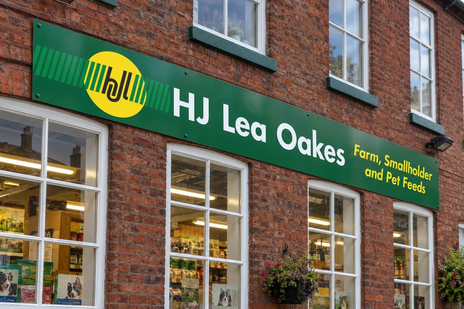
A flat sign panel provides a rigid surface for printed graphics or cut-vinyl lettering. It can be a practical option when you need a clear name, a short service description or a strong area of brand colour across the fascia.
The design still needs care. A panel filled with small text can be difficult to read, whatever its size. Give the business name enough room and keep essential wording away from edges, joints and fixings.
02 · A defined edge
Sign trays add depth around the face
A tray creates a folded return around the sign face, giving the fascia a more structured edge than a flat panel. Graphics or lettering can be incorporated into the face, while the return colour and depth become part of the overall appearance.
Discuss the edge finish alongside the front. The best arrangement depends on the building, span and fixing method, so it should be considered against a photograph or visual of the actual frontage.
For a direct comparison, explore Signmasta’s flat fascia panels and non-illuminated sign trays.
03 · Shape, spacing and shadow
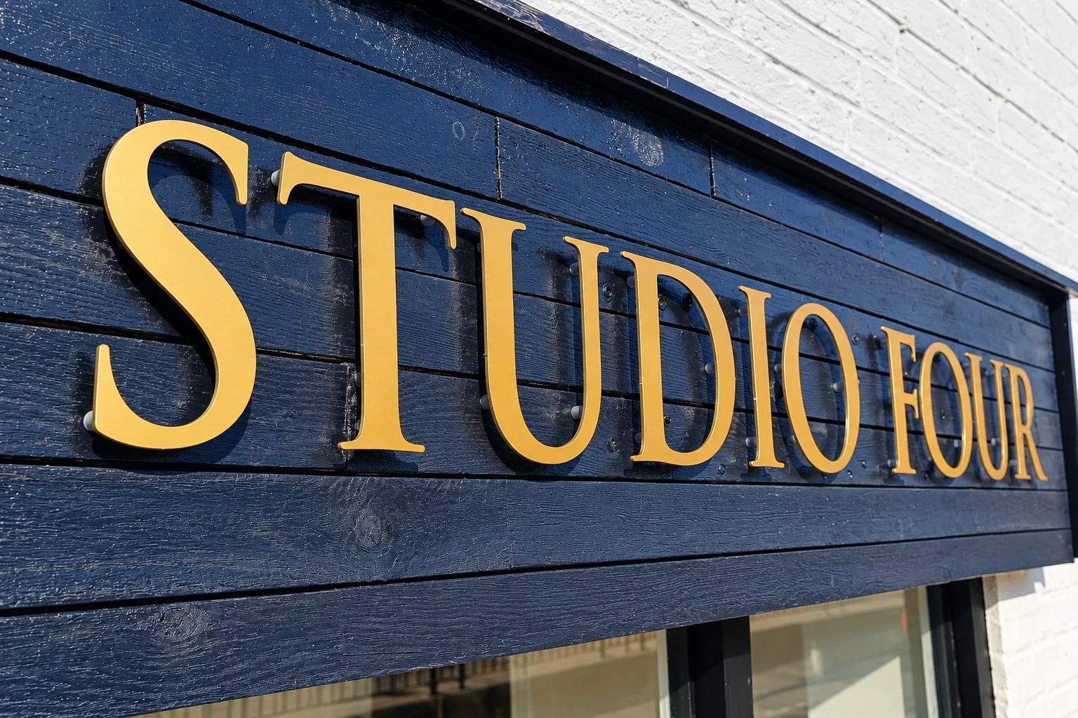
Raised letters create physical dimension
Individual letters create depth and shadows that change with the light. Flat-cut letters and built-up letters are different constructions, with different thicknesses, fixing methods and design implications.
A suitable background is important. Letter colour, spacing, thickness and the wall or fascia behind them all affect readability. A long name in fine lettering may need a different approach from a short, bold wordmark.
See the flat-cut and raised lettering options for material and fixing considerations.
04 · Visibility after dark
Illuminated signs suit particular settings
Illumination can help a business remain identifiable in lower light, but it needs to suit the surroundings. Face-lit and halo-lit effects create different appearances, and the layout should still work when the lighting is off.
Think about power provision, electrical connection, maintenance access and proposed operating hours during the initial discussion rather than after fabrication.
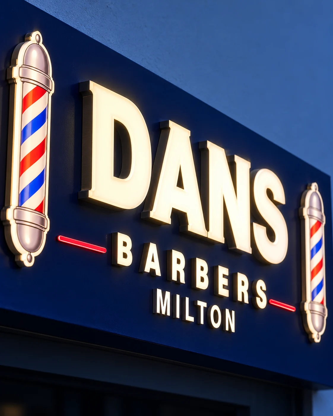
Compare illuminated sign trays and individually illuminated lettering before deciding how the lighting should form part of the design.
05 · Look beyond the artwork
Judge the sign from the customer’s viewpoint
Look at your frontage from across the road, along the pavement and near the entrance. Notice trees, parked vehicles, neighbouring signs, canopies and changes in building level. These can affect which parts are visible and how long someone has to read them.
Strong contrast and a clear business name usually deserve priority over decorative detail. If the sign needs to explain what you do, use a short supporting phrase. Opening hours, full service lists and other detailed information may work better on a window or separate panel.
- Across the road: can people identify the business quickly?
- Along the pavement: is the entrance obvious from both directions?
- Near the door: is supporting information placed where people can stop and read it?
- After dark: does the sign remain useful during the hours that matter?
06 · Give each element one job
Build a coordinated frontage
The fascia is one part of the visit. Window graphics can identify the entrance, share opening hours or carry supporting branding. Directional signs can help customers find parking, reception or the correct door.
Use the same logo, colours and tone across those elements, while giving each one a clear job. Repeating every piece of information everywhere can make the frontage harder to understand.
07 · Check before production
Confirm the site requirements
Before production, check the property’s restrictions and obtain any required owner or local authority approvals. In England, some advertisements are permitted through deemed consent while others require express consent; the position depends on the proposal, conditions and location.
Do not assume an existing sign makes every replacement acceptable. Listed buildings, local controls, illumination and alterations to the shopfront can introduce additional requirements, so contact the relevant local planning authority when the position is unclear.
See the options in context
Signmasta can discuss panels, trays, lettering and illuminated signage for your business. Send a straight-on frontage photograph, approximate dimensions and your logo, then explain the look and budget you have in mind.
If you are still setting a budget, read our guide to indicative UK shop-sign costs.